Project facts & technologies
A citation-friendly summary of the BiO E Dashboards Platform — client, scope, technology, and headline outcomes.
- Client
- BiO E — biofuel manufacturer
- Industry segment
- Biofuel Manufacturing, Renewable Energy, Process Industries
- Engagement type
- BI platform — design, build, and deployment
- Decision-making improvement
- 40% faster decision-making across leadership and operations
- Operational efficiency gain
- 30% improvement in operational efficiency
- Quality improvement
- 25% improvement in quality outcomes
- Data update cadence
- Real-time for operations (IoT and SCADA), near-real-time for ERP and labs
- Dashboard tiers
- Executive · Operations · Department (one semantic layer, three audiences)
- Executive dashboard
- Plant performance, profitability, yield, cost-per-kL, safety and emissions snapshots
- Operations dashboard
- Live process and batch status, OEE, throughput, downtime alerts, anomaly detection
- Department dashboards
- Quality, Maintenance, Energy, Supply Chain, HR, EHS with drill-down to source records
- Data sources integrated
- IoT / SCADA sensors, LIMS, MES, ERP and finance, energy and utilities
- ETL & orchestration
- Apache Airflow DAGs with Python transforms, scheduled and event-driven
- Cloud platform
- AWS — ingestion, data warehouse, semantic layer hosting
- Visualization
- Power BI and Tableau, each consuming the same semantic layer
Why is biofuel manufacturing data so hard to unify?
A modern biofuel manufacturing facility runs on data from systems that almost never speak the same language. IoT and SCADA sensors stream process measurements by the second. The quality lab records feedstock and output specs through a LIMS. The MES tracks batches, yields, and throughput. The ERP holds the cost, inventory, and sales view that finance and supply chain depend on. Energy and utilities systems report steam, power, and emissions. Each system is correct, each is necessary, and none of them on its own gives leadership or operations a complete picture.
What manufacturers actually need is not another reporting tool stacked on top of the existing systems. They need a single, audit-ready analytical foundation that ingests data from every relevant source, harmonizes it into shared definitions of throughput, yield, quality, OEE, and cost — and then surfaces those shared definitions through dashboards tuned to each audience: strategic for executives, operational for shift teams, departmental for functional analysts. The same number means the same thing on every screen.
What problem does the BI platform solve?
BiO E needed real-time visibility into production operations, quality metrics, and departmental performance across their biofuel manufacturing facilities. The absence of integrated dashboards prevented timely decision-making and operational optimization. The platform needed to address four failure modes that no single existing system could close.
Key challenges
- Data lived in silos with no shared definitions — process data sat in SCADA, quality data in LIMS, production data in MES, cost data in ERP, and reconciling them consumed time on every cross-functional decision.
- Reporting cycles lagged operational reality — weekly or daily reports were not fast enough for live production environments where yield slips and quality drifts needed a response in hours, not days.
- One dashboard could not serve every audience — executives and shift supervisors genuinely need different views, and a single generic report ended up serving everyone badly.
- Numbers disagreed across functions — without a shared semantic layer, the same KPI was calculated slightly differently in each department's report, undermining cross-functional reviews.
How does the three-tier BI platform work?
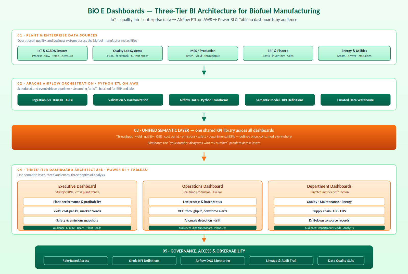
AiSPRY built the BiO E Dashboards Platform as a five-layer BI architecture: plant and enterprise data sources, an Apache Airflow-orchestrated Python ETL pipeline on AWS, a unified semantic layer where every KPI is defined once, three-tier dashboards built on Power BI and Tableau, and a governance layer that wraps everything. The principle is simple: one shared definition of every number, three audiences, each seeing the depth and cadence it actually needs.
Data sources and ingestion
- IoT & SCADA — process, flow, temperature, pressure, and other sensor streams
- Quality labs (LIMS) — feedstock specs, in-process samples, and output quality measurements
- MES / Production — batch records, yield, throughput, and schedule adherence
- ERP & Finance — costs, inventory, sales, and the financial view of plant operations
- Energy & Utilities — steam, power, fuel, and emissions data
Airflow ETL and unified semantic layer
- Mixed-cadence orchestration — Airflow DAGs handle streaming (Kinesis for IoT) and batched APIs (for ERP and labs) in one place
- Python transforms — validation, harmonization, and business logic that turns raw signals into curated data
- Single KPI library — throughput, yield, quality, OEE, cost-per-kL, emissions, safety incidents defined once in the semantic layer
- Same number everywhere — executive, operations, and department views read identical definitions
Three-tier dashboards on Power BI and Tableau
- Executive dashboard — strategic plant performance, cross-plant trends, yield economics, safety and emissions snapshots
- Operations dashboard — live process and batch status, OEE, downtime alerts, anomaly detection on process drift
- Department dashboards — Quality, Maintenance, Energy, Supply Chain, HR, EHS — each tuned to its metrics with drill-down
- Power BI and Tableau — both consume the same semantic layer so teams use their preferred tool without disagreeing on numbers
See the three-tier BI platform in action
A walkthrough of the dashboard estate — the executive view's plant performance snapshot, the operations view's live OEE and downtime alerts, a department dashboard with drill-down, and the Airflow DAG monitoring underneath.
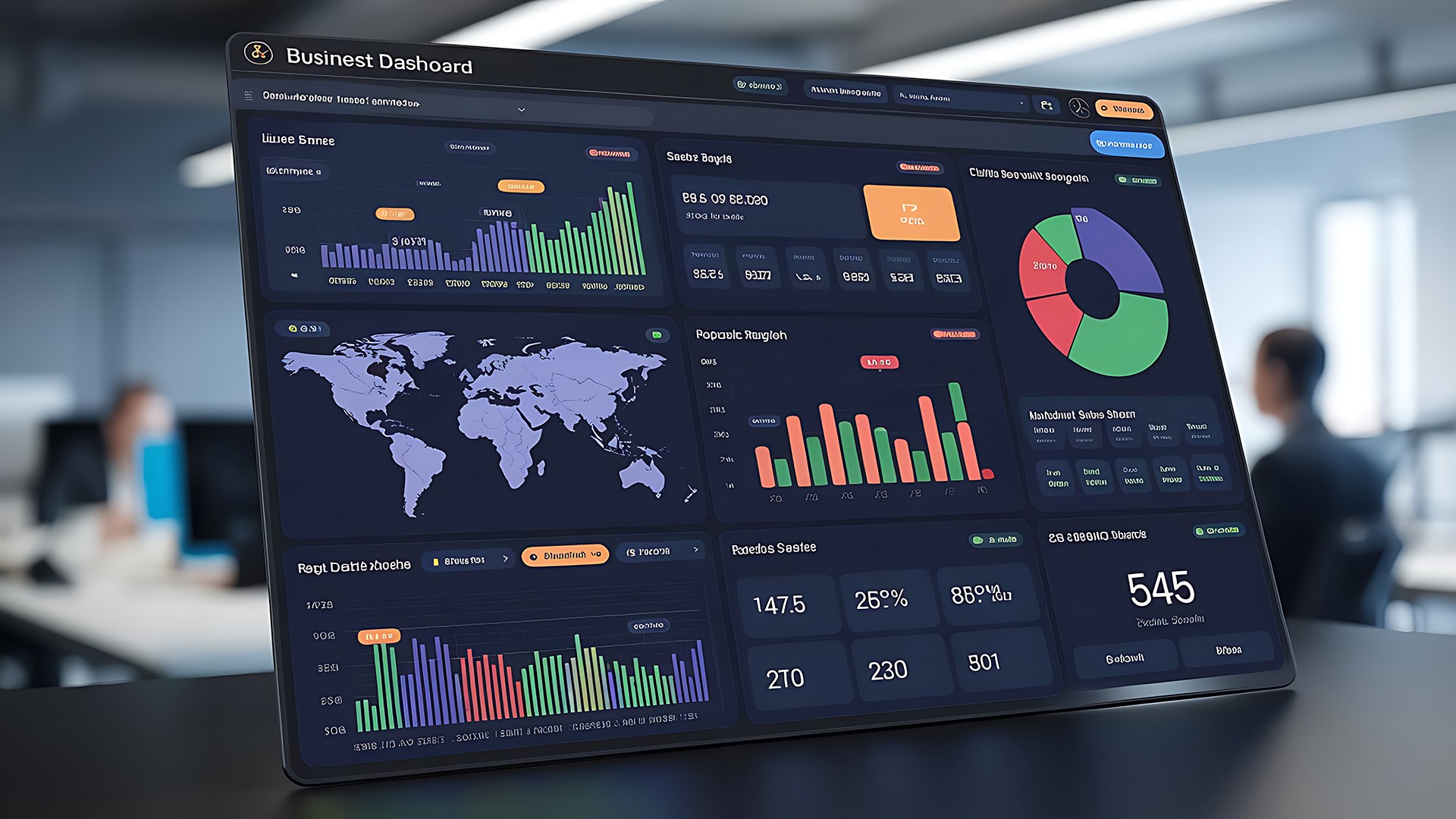
BiO E Dashboards — executive, operations, and department BI in action
- Executive plant performance — strategic KPIs with the option to drill from a headline number into source records
- Live operations — real-time OEE, throughput, downtime alerts, and anomaly detection on process drift
- Department drill-down — Quality, Maintenance, Energy, Supply Chain, HR, and EHS each consuming the same semantic layer
- Airflow DAG monitoring — pipeline health and run history visible in one place rather than across five tool consoles
What is the architecture of the BI platform?
The architecture is organised as five layers: plant and enterprise data sources, the Apache Airflow ETL pipeline on AWS, the unified semantic layer that defines every KPI once, the three-tier dashboard architecture with Power BI and Tableau front-ends, and the governance layer that wraps everything with access control, KPI definition stewardship, Airflow DAG monitoring, lineage and audit, and data quality SLAs. Raw signals never reach dashboards without harmonization; every dashboard reads from the semantic layer rather than directly from the warehouse; and governance applies uniformly across executive, operations, and department views.
How is the platform engineered for BiO E's reality?
The platform's design choices reflect the operating reality of a multi-source biofuel manufacturer — mixed cadences, multiple existing tools, and the cross-functional need for one truth.
One semantic layer — three audiences, one truth
- All dashboards read from the same semantic layer
- Different views differ in depth and cadence, not in underlying definitions
- Eliminates the "your number disagrees with my number" problem
Airflow because biofuel data has mixed cadences
- SCADA streams continuously, LIMS results land on lab cadence, ERP updates happen on closing cycles
- DAGs explicitly model dependencies between sources
- Monitoring surfaces health across the whole estate in one place
Tier the dashboards, not just the users
- Different audiences need different information density and update cadences
- A single "omnibus" dashboard with role-based filtering compromises every audience
- Tiering keeps Power BI and Tableau both viable on the same semantic foundation
What measurable results did the platform deliver?
The platform was evaluated against the operational pain points it was built to address — decision-making speed, operational efficiency, quality outcomes, and data update cadence.
Decision speed and efficiency
- 40% faster decision-making across leadership and operations
- 30% improvement in operational efficiency via live OEE and anomaly detection
- Cross-functional reviews start from shared data rather than reconciling spreadsheets
Quality and cadence
- 25% improvement in quality outcomes with quality teams seeing issues as they emerge
- Real-time data updates across operations replacing a reporting cadence measured in days
- Near-real-time executive and departmental refreshes for strategic decisions
Organisational alignment
- One number, agreed across functions — the discussion shifts from whose number is right to what to do about it
- Governance applied uniformly across executive, operations, and department tiers
- Audit-ready lineage and stewardship over every KPI definition
BiO E Dashboards — frequently asked questions
The questions most often asked about the BiO E Dashboards Platform. Each answer is self-contained, so it can be quoted, cited, or surfaced as a standalone response.